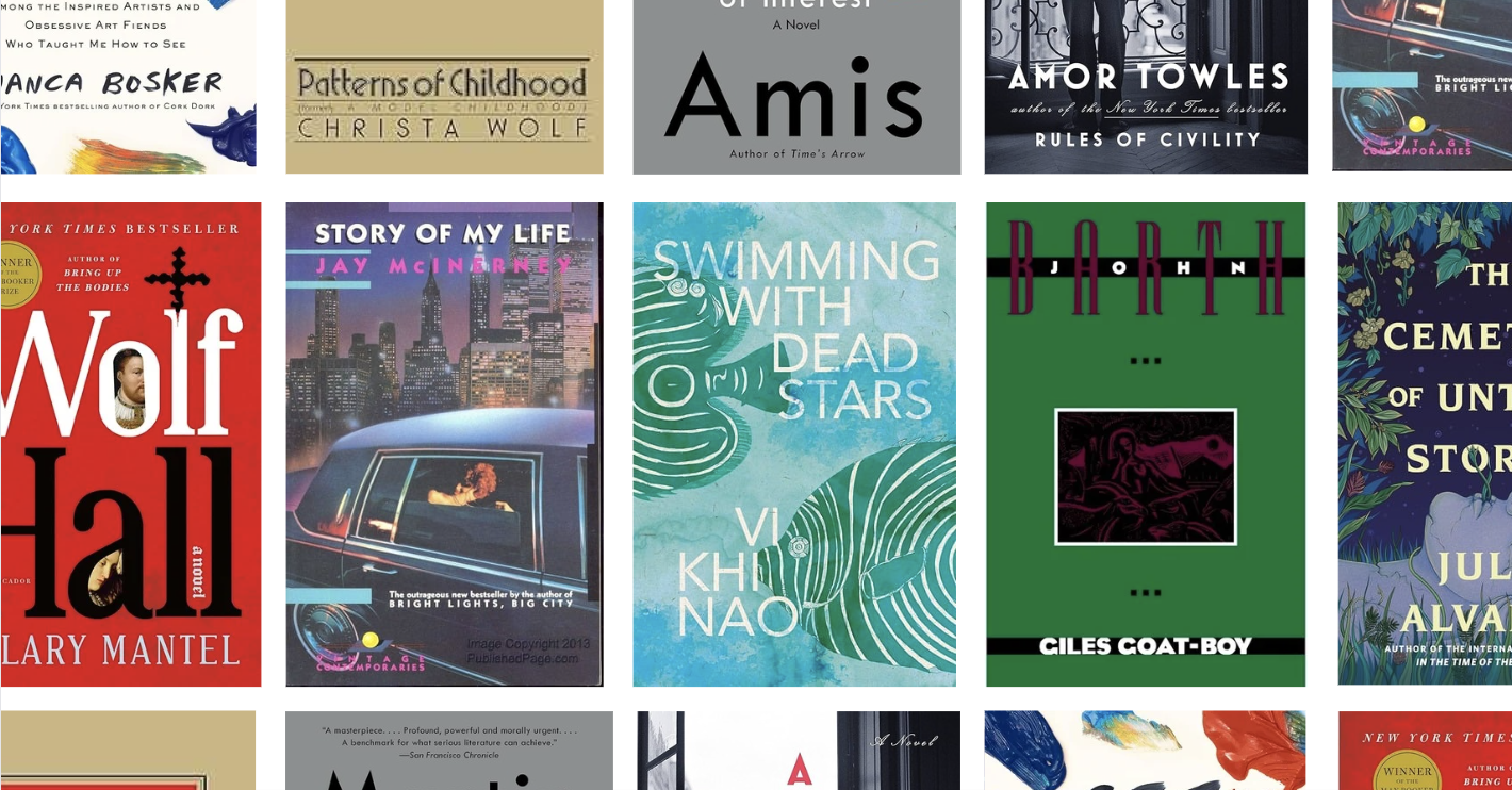
I’ve always thought that British book covers, generally speaking, are nicer looking than their American counterparts, with the latter seeking to target a demographic rather than to dazzle the eye. With this in mind, the following is an incredibly unscientific experiment in aesthetics. I’ve taken as a sample the Tournament of Books contenders whose American and British editions differ. The American covers are on the left, and clicking through takes you to a larger image. Your equally inexpert commentary is welcomed in the comments.
 |
 |
| Both are dark and complex, but I think I like the American one here. It’s the big red 2666 that does it for me, and I’m not crazy about the digital clock action on the British cover. | |
 |
 |
| The American cover wins this one going away. I love the serious elegance of the bent arm and smoky cigarette and the mysterious juxtaposition of yellow and red lights. I appreciate the playful fonts and colors of the British version, but it is treading too far into “chick lit” territory for my taste. | |
 |
 |
| Even though I find the color a bit jarring, the boldness of the British cover is something you rarely seem to find in American covers. The American cover meanwhile seems to be trying terribly hard to be interesting. | |
 |
 |
| The American cover has a nifty diorama quality to it, but I love the British cover with its bold yet grainy font and its washed out, almost painterly quality. | |
 |
 |
| The American cover is nice enough, but it seems to be begging to be named an Oprah pick. The British cover, meanwhile, is my favorite of this little exercise. The wave motif is Eastern, but closer inspection shows that it is not merely an appropriation of the style. There’s a charming, cartoonish, anthropomorphic quality to the wave crests that I find really engaging. And the colors are terrific. | |
 |
 |
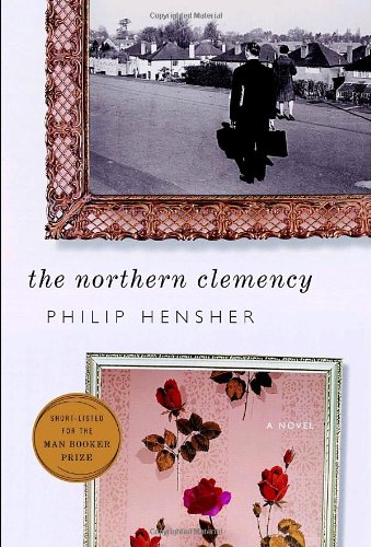
| In this case, its the reverse. The British cover looks like the Oprah pick, while the American cover offers up more mystery. I particularly like the font on the American cover, all pock-marked like that of a 300-year-old text. | |